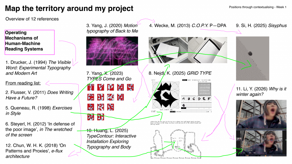
This written response was written during the summer break, so some of the ideas in it differ from the direction of development I’m pursuing now. (^_^)
Category: Uncategorised
-
Written Response – Positions through contextualising
Annotated Bibliography
1. Drucker, J. (1994) The Visible Word: Experimental Typography and Modern Art, 1909–1923. Chicago: University of Chicago Press, p.3.
Sample: Typography operates as a visual system, not merely a linguistic one. (Drucker, 1994, p.3)
Drucker defines typography as a visual system rather than merely a linguistic carrier, which leads me to understand legibility as a visual condition that can be reshaped, or as a strategy that can be practiced. My aim is to explore the similarities and differences between machine and human mechanisms of recognising legibility. Humans can rely on context and association to complete meaning from incomplete information, whereas machines tend to depend on character outlines and structural features to make logical inferences.
In order to obtain more samples to analyse my research direction, I added functions to my website (my project) that can disrupt the visual structure of text. These functions are built based on OCR (Optical Character Recognition) mechanisms, including character shape, stroke continuity, and contrast & edge. Through this mode of practice, I challenge both human and machine modes of understanding, and identify the fundamental differences between these two recognition systems in the process.
·
2. Flusser, V. (2011) Does Writing Have a Future? Minneapolis: University of Minnesota Press, p.3.Sample: Information is now more effectively transmitted by codes other than those of written signs. (Flusser, 2011, p.3)
Flusser’s discussion of technical images and coding systems points out that writing is shifting from a linear structure based on the alphabet to an information system composed of multiple technical codes. This suggests that in the future, text may gradually no longer be intended for human reading, but instead exist in forms that are more easily processed by machines, such as being handled and transmitted through more efficient technical media. These codes transform text into data structures, thereby altering how legibility is determined. However, this does not mean that human reading systems should be marginalised.
Based on this, my project explores and questions how legibility will be redefined when writing is taken over by machines. Therefore, I interfere with OCR recognition mechanisms to resist this tendency, allowing text to detach from machine grammar. Through this practice, I aim to explore whether design can possess the possibility of refusing machine recognition, and whether we can use design to reclaim ownership over text—for example, by creating distorted typography that can only be understood by humans but not recognised by machines.
·
3. Yang, J. (2020) Motion typography of Back to Me. Available at: https://bennybiangbiang.com/Back-to-me (Accessed: 27 April 2026).
Sample:

During my research, I found that machines’ ability to recognise dynamic content is significantly weaker than that of humans. This led me to explore dynamic typographic effects. The film produced by Yang inspired me to experiment with dynamic deformation of text.
In this film, the motion of the text changes according to the rhythm of the background music; the more intense the rhythm, the greater the amplitude of the movement. This makes legibility a constantly shifting condition.
For machines, recognition relies on clear character structures within fixed frames, and dynamic deformation interferes with OCR detection mechanisms. Humans, however, can integrate information through temporal continuity; even if a single frame cannot be recognised, meaning can still be inferred through the process of change. In my website, I combine animation speed with distortion so that text remains in a continuously unfinished state, creating a reading environment that is unfriendly to machines but perceptible to humans. This reinforces the distinction that human recognition is temporal, while machine recognition is structural.
·
4. Wecke, M. (2013) C.O.P.Y. P—DPA. Available at: https://p-dpa.net/work/c-o-p-y/ (Accessed: 27 April 2026).
Sample: The pages of C.O.P.Y remain empty for the human eye. After xeroxing or scanning the book reveals the essay “Copyright, Copyleft and the Creative Anti-Commons” by Anna Nimus. As in open source development, the text’s quality (legibility) gets better with every copy.
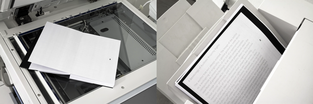
In order to conduct exercises that place human and machine legibility side by side, I also created conditions that are favourable to machines but unfavourable to human recognition. My inspiration comes from Wecke’s project C.O.P.Y. In this work, Wecke constructs a machine-prioritised legibility, where the text in the publication is invisible to the human eye and can only be revealed through photocopying or scanning. This mechanism reverses the conventional reading relationship, making the machine the first reader, while humans can only access legibility through the machine.
This brings the discussion back to the question of who has the right to read. In other words, legibility is not simply a property of text; its boundaries are often determined by who the reading subject is. This becomes evidence for my exploration of the differences between human and machine legibility: how design can manipulate the tendency of legibility and place it within a framework that defines who is able to read.
·
5. Queneau, R. (1998) Exercises in Style. London: John Calder.Sample: This is a collection of 99 retellings of the same story, each in a different style.
In Exercises in Style, Queneau’s experiment of rewriting the same text in 99 variations reveals that textual comprehensibility does not depend on a single form, but can be continuously reconstructed through structural variation. The success of these experiments is closely related to human recognition mechanisms: humans can rely on context, experience, and linguistic patterns to maintain understanding even when the style of a text changes drastically, allowing meaning to exist independently of fixed form.
Queneau’s stylistic variations led me to treat my text-distortion website as an experimental field for testing the tolerance of legibility. By adjusting different parameters, I generate a large number of distorted texts, similar to Queneau’s writing experiments, in order to compare human and machine recognition strategies when encountering transformed text. For example, when faced with difficult-to-read text, humans may move closer, step back, or squint to perceive blurred outlines. Machines cannot do this, but they are able to detect subtle pixel-level information that is imperceptible to the human eye, and use large datasets and recognition models to select the most probable result. Although the two recognition systems differ, both gradually clarify their respective analytical paths through changes in the visual form of text.
·
6. Steyerl, H. (2012) ‘In defense of the poor image’, in The wretched of the screen. Berlin: Sternberg Press, p32.Sample: The poor image tends toward abstraction: it is a visual idea in its very becoming. (Steyerl, 2012, p.32)
Steyerl describes the poor image as a visual state that tends toward abstraction through continuous circulation and compression. As image quality decreases, meaning is formed through an ongoing process of generation and transformation. This perspective challenges my earlier practice. Previously, I tended to produce illegibility by disrupting character structures in order to distinguish between human and machine recognition. However, Steyerl argues that when visual information is compressed or disturbed, it does not necessarily become unreadable, but instead enters different reading logics—for example, a mode of recognition that depends on distribution and circulation.
This prompted me to reconsider the differences between machine and human recognition, leading me to generate a series of low-quality textual images for machine recognition. In practice, certain low-quality visual states (such as blur or noise) do not prevent machine recognition. In contrast, humans may lose recognition ability earlier when confronted with highly abstract visual information. Therefore, my research direction shifts from producing illegibility to testing asymmetries between different recognition systems (different humans and different algorithmic models), exploring how legibility dynamically shifts and emerges across different cognitive systems.
·
Line of Enquiry:
This project investigates how legibility operates differently in human and machine reading systems. Traditional typography is designed to achieve clarity or express a particular mode of interpretation (Flusser, 2011), whereas contemporary computational systems such as OCR rely on specific visual features (character shape, stroke continuity, and contrast & edge) to recognise text. I construct an interactive text-distortion website to interfere with these features and analyse their mechanisms.
The focus of this project is not simply to reduce legibility until both humans and machines fail to recognise text. Instead, I aim to observe how legibility shifts, persists, or breaks down across different systems. By generating conditions where text is machine-readable but human-unreadable, and vice versa, I compare the asymmetry between these two recognition logics. I reconceptualise legibility as a dynamic relationship dependent on the reading subject, and use design as a method to redistribute the capacity for recognition across different cognitive systems.
·
7. Yang, X. (2023) TYPES Come and Go. [Online] Available at: https://www.gdcaward.com/op/before_works/detail?id=1009&index=1&backurl=https%3A%2F%2Fgdcaward.com%3A443%2Fhomepage%3Flang%3Dcn&lang=cn (Accessed: 30 April 2026).
Sample:
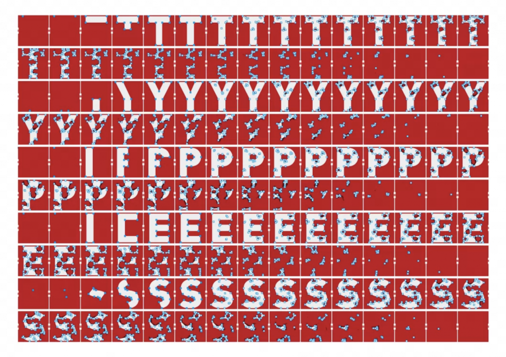
TYPES Come and Go approaches its research from the paradox that stainless steel can rust, and in conjunction with the growth patterns of rust, employs typographic experimentation to interpret the cycle of iron as an element — forming a typography system co-forged by natural phenomena and human participation. This concept of translating the process of change in natural materials prompted me to expand my investigation of letterform into the direction of gradually generating content through the logic of the natural world. It led me to ask: how can the traces of biological growth serve as an expression of a project’s conceptual framework.
More specifically, my decision to use organisms from the natural world as my subject of study was an iteration of my prior Enquiry Line — seeking out the differences and coexistence between nature and machine through the traces of natural evolution. This is because natural products can grow organically, whereas machines can only learn and evolve through existing knowledge.
The logic by which slime mold searches for food bears a resemblance to the logic by which AI searches for answers: both conduct rapid breadth-first searches with feedback mechanisms to identify the fastest and most optimal route. This is the reason I selected slime mold as my subject of study and proceeded to develop my research further. I therefore chose slime mold as my research subject, and sent my requirements to AI, asking it to generate code from a machine’s perspective to simulate slime mold.
·
8. Lague, S. (2021) Coding Adventure: Ant and Slime Simulations [YouTube video]. Available at: https://www.youtube.com/watch?v=X-iSQQgOd1A (Accessed: 18 May 2026).
Sample:
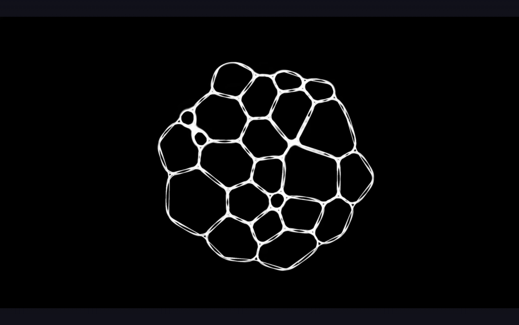
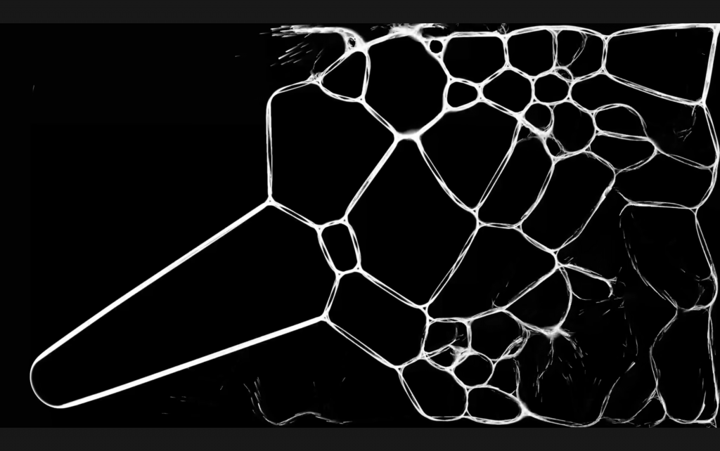
I asked AI to help me build this new feature, but it struggled to understand what I was describing. Initially, when I used natural language to instruct the AI — phrases such as “make it more like slime mold,” “give it more vitality,” or “don’t make it look like an ordinary line animation” — it frequently produced visually confusing outputs. I then began searching for coding tutorials related to slime mold, and started communicating with the AI in language closer to the way machines process meaning — terms such as agent-based simulation and pheromone trails. Lague’s slime mold effect coding tutorial proved pivotal. This reference functioned as a form of translation for me, enabling me to understand the behavioural systems and operational logic of code-based programming.
The process of this exploration itself became one of my research methods: I treated my communication with AI as a means of investigating the differences between human and machine. Throughout this process, I observed how the AI interpreted and misread the content I was expressing. By continuously defining rules for the AI — constraining its tendency toward “overinterpretation” and semantic distortion, and providing references and limiting conditions — I transformed human-machine collaboration into a practical experiment concerning legibility and comprehension. This is also the significance of my process of negotiation with the machine.
·
9. Valladares, D. (2023) Organism Generator. Available at: https://valladares.dev/organism-generator (Accessed: 18 May 2026).
Sample:
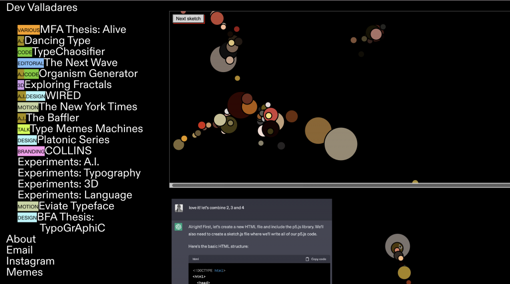
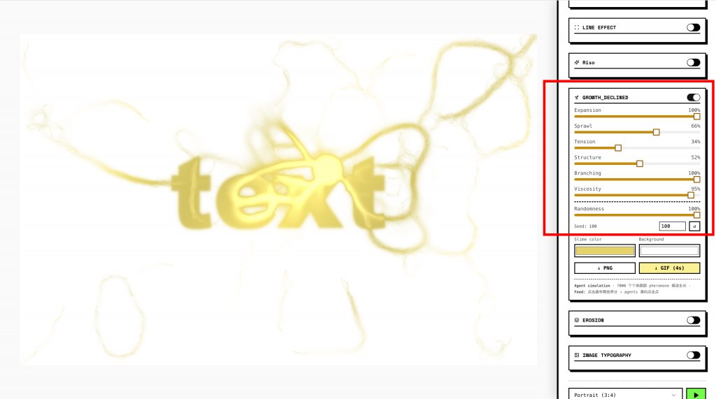
Valladares’s project Organism Generator provided me with inspiration for interactive web functionality. Like my own project, this website was built with AI assistance. Valladares documented his conversation process with ChatGPT, and used p5.js to create the interactive features within the site. It inspired the “Feed” function I subsequently incorporated into my website. Within my slime mold typography system, when the mouse clicks anywhere on the screen, that position is treated as a high-concentration nutrient zone that attracts the slime mold. The slime mold trails, which originally grow along the structural forms of the letterforms, temporarily abandon their typographic configurations and rapidly converge toward the clicked location. Within this interaction, the audience’s use of sliders to adjust parameters is conceived as an act of altering the growth conditions of a living organism.
The Feed function responds to my research on legibility. It invites the audience to participate in the process through which legibility is constructed and dismantled. The user’s clicks simultaneously generate new visual aggregations and accelerate the dissolution of textual meaning. Through this function, I aim to convey to the viewer that what I have created is not a website that produces fixed images through SVG filter effects — it is a dynamic system that is continuously transformed by interaction, by human agency, and by the machine.
·
10. Chun, W. H. K. (2018) ‘On Patterns and Proxies’, e-flux architecture. [Online] Available at: https://www.e-flux.com/architecture/accumulation/212275/on-patterns-and-proxies (Accessed: 30 April 2026).
Sample (My Work):
In order to further understand the logical patterns of machines, I referenced Chun’s discussion in On Patterns and Proxies, in which she addresses two core concepts in machine learning and algorithmic recognition: pattern recognition and proxy. She argues that machines do not recognise the world through understanding in any human sense, but rather make judgements through statistical patterns and proxy features. That is to say, algorithms do not truly comprehend faces, letters, or identities — they merely identify a set of features that can be computed and classified. This argument connects directly to my project, as the Interactive Typography Website I have produced tests, through various methods and interventions, how these proxy features are recognised and how they break down.
Chun’s perspective offers a precise critical framework that prompted me to reconsider legibility in terms of both human and machine recognition. In the earlier stages of my project, I framed human and machine recognition as opposing modes of judgement: humans rely on context and association, while machines rely on structure and feature. However, Chun’s position on pattern led me to recognise that human reading is also dependent on pattern — although this pattern is not entirely equivalent to the machine’s proxy model. This shifted my research from exploring what is legible to humans but not to machines, toward asking: “What kinds of patterns does each recognition system depend upon? Under what conditions does each maintain legibility, and under what conditions does it break down?”
Chun’s argument suggests that machine recognition is not a neutral technical process — it is a power mechanism that transforms the world into computable features. This directly connects to the inquiry within my project concerning who is authorised to read. When design can render text legible to humans but not to machines, or legible to machines but not to humans, legibility is no longer an intrinsic property of the text itself — it becomes a relationship that is allocated on the basis of power. OCR’s recognition of text depends on visually computable cues such as character outlines, stroke continuity, edge clarity, and shape similarity. In Chun’s framework, these cues are understood as the proxies through which machines are able to identify text.
I therefore incorporated new features into the website through which audiences can use sliders and the Feed function to allow the slime mold growth system to participate in this allocation. These features can disrupt the morphology of letterforms, causing the character outlines, stroke continuity, edge clarity, and shape similarity of letters to lose regularity and become difficult to decipher — thereby undermining the proxy features upon which machines rely to identify text. Within the slime mold function, letters are gradually conjoined and reorganised through a biomorphic growth logic. This process transforms text from a stable object of recognition into a continuously evolving visual system that resists easy categorisation. This approach redirects the purpose of the text produced by the website: shifting from the goal of image quality degradation toward a reorganisation of the judgement structures upon which machines depend. I hope that this allows audiences, through their engagement with the function, to experience the process by which legibility is gradually constructed and dissolved through their own acts of “allocation.” In doing so, I employ my visual experiment as a bridge between the study of the politics of legibility and the relational dynamics of human-machine communication.
·
11. Duterne, M. (2023) Physarum type tool. Available at: https://maxenceduterne.com/physarumtype (Accessed: 18 May 2026).
Sample:
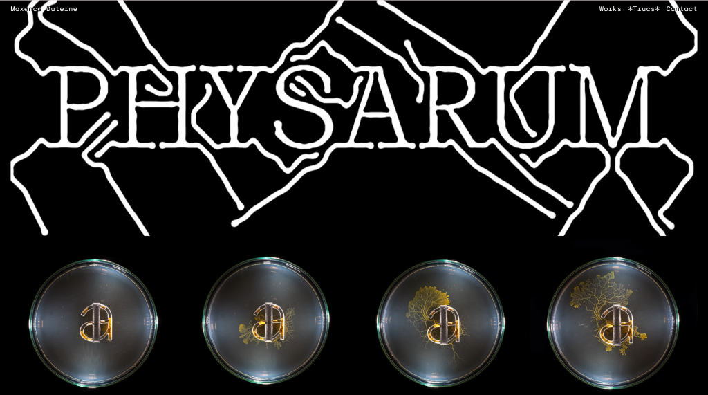
Duterne’s Physarum Type Tool is a custom ecological simulation type tool that simulates physarum. It conceives of typography as a process capable of growing, diffusing, and losing stable boundaries. Within this project, the visual form of text exists in a state of continuous generation and transformation — an approach very close in spirit to my own project. I therefore drew on the visual effects presented in the Physarum Type Tool as a reference. In this project, the edges of letterforms are encroached upon by a growth logic analogous to that of Physarum polycephalum; strokes gradually extend outward, altering the original typographic structure in the process of expansion. Specifically, once text is entered into the website, the letters begin from a relatively conventional serif structure and progressively develop the tendril-like extensions characteristic of physarum. The entire process cannot be rewound or halted, requiring the audience to observe its continuous evolution without being able to fully control it.
The key critical stance of this project is embedded within its formal properties. It embodies a force through which nature is gradually reorganised in the process of growth, and employs the means of machine-simulated nature to manifest a sense of dramatic contradictory tension. For me, this represented an important provocation and inspiration. It prompted me to ask: what happens if the meaning of typography no longer derives from the designer’s direct control over form, but rather from the growth process of the system itself? As a result, across the second and third weeks of my website iterations, my focus gradually shifted from controlling typographic deformation toward allowing the text to be taken over by a biomorphic system. Having analysed what type of code the Physarum Type Tool used to achieve this cyclical effect, it became for me less a visual reference than a resource for exploring how humans and machines communicate with one another.
Consequently, in the third-week iteration, I removed the sliders and instead established a more autonomous slime mold growth system. This system is structured across three stages: Early Growth, Expansion, and Overgrowth. The text initially remains legible, but as the slime mold form diffuses freely, the letterforms gradually coalesce until they become an organic mass that can no longer be stably read. This transformation shifted my project from an interactive typography tool to an autonomous typographic organism.
Duterne’s project deepened my understanding of graphic communication design — specifically, the use of typography as a medium to generate meaning through loss of control and instability. It embodies communication through the very process by which text progressively loses its legibility. For instance, when I input the text “read this” into the website, the process by which the text is gradually eroded and rendered illegible itself communicates the core intention of the project. In this process, meaning migrates from semantic content to visual transformation and system behaviour. Duterne’s project therefore not only provided a reference for my visual form, but also helped me understand typography as a communication system possessing vitality, processuality, and performativity. This shifted my understanding of typography from a visual form controlled by the designer to a visual practice realised through human-machine collaboration.
·
12. Tsing, A.L. (2015) The Mushroom at the End of the World: On the Possibility of Life in Capitalist Ruins. Princeton University Press.Tsing’s The Mushroom at the End of the World provided my project with a broader ecological and critical framework. Although this book is not a direct reference to typography or coding, it helped me reconceptualise the duality of “ruins” and “mycorrhizal symbiosis” — that is, their coexistence rather than mutual annihilation. Within this condition, the relationship between existence and dissolution is one of symbiotic relationship: they sustain one another and co-evolve. The mushroom, as a particularly exemplary carrier, embodies precisely this. This concept of exploring relational dynamics and the generation of meaning formed a critical connection with my practice of investigating the collapse of legibility.
Tsing’s discussion of unstable ecological relationships inspired my thinking about communication: the disappearance of legibility does not equate to the disappearance of meaning, but rather signals the beginning of another form of communication. Tsing’s framework enabled me to understand slime mold typography as an ecological communication system — in which text, audience, AI, and biological logic collectively constitute an unstable relational network. This exploratory trajectory has also continuously reminded me, throughout subsequent iterations, to regard the loss of control within code as a productive new material, and to incorporate it as a constituent part of the research. This directly responds to the central concern of my project: how meaning continues to be generated under conditions that cannot be fully controlled.
-
Written Response – Positions through iterating
Annotated Bibliography:
1. Drucker, J. (1994) The Visible Word: Experimental Typography and Modern Art, 1909–1923. Chicago: University of Chicago Press, p.3.
Sample:
Typography operates as a visual system, not merely a linguistic one. (Drucker, 1994, p.3)
Annotation:
Drucker defines typography as a visual system rather than merely a linguistic carrier, which leads me to understand legibility as a visual condition that can be reshaped, or as a strategy that can be practiced. My aim is to explore the similarities and differences between machine and human mechanisms of recognising legibility. Humans can rely on context and association to complete meaning from incomplete information, whereas machines tend to depend on character outlines and structural features to make logical inferences.
In order to obtain more samples to analyse my research direction, I added functions to my website (my project) that can disrupt the visual structure of text. These functions are built based on OCR (Optical Character Recognition) mechanisms, including character shape, stroke continuity, and contrast & edge. Through this mode of practice, I challenge both human and machine modes of understanding, and identify the fundamental differences between these two recognition systems in the process.
·
2. Flusser, V. (2011) Does Writing Have a Future? Minneapolis: University of Minnesota Press, p.3.
Sample:
Information is now more effectively transmitted by codes other than those of written signs. (Flusser, 2011, p.3)
Annotation:
Flusser’s discussion of technical images and coding systems points out that writing is shifting from a linear structure based on the alphabet to an information system composed of multiple technical codes. This suggests that in the future, text may gradually no longer be intended for human reading, but instead exist in forms that are more easily processed by machines, such as being handled and transmitted through more efficient technical media. These codes transform text into data structures, thereby altering how legibility is determined. However, this does not mean that human reading systems should be marginalised.
Based on this, my project explores and questions how legibility will be redefined when writing is taken over by machines. Therefore, I interfere with OCR recognition mechanisms to resist this tendency, allowing text to detach from machine grammar. Through this practice, I aim to explore whether design can possess the possibility of refusing machine recognition, and whether we can use design to reclaim ownership over text—for example, by creating distorted typography that can only be understood by humans but not recognised by machines.
·
3. Yang, J. (2020) Motion typography of Back to Me. Available at: https://bennybiangbiang.com/Back-to-me (Accessed: 27 April 2026).
Sample:

Annotation:
During my research, I found that machines’ ability to recognise dynamic content is significantly weaker than that of humans. This led me to explore dynamic typographic effects. The film produced by Yang inspired me to experiment with dynamic deformation of text.
In this film, the motion of the text changes according to the rhythm of the background music; the more intense the rhythm, the greater the amplitude of the movement. This makes legibility a constantly shifting condition.
For machines, recognition relies on clear character structures within fixed frames, and dynamic deformation interferes with OCR detection mechanisms. Humans, however, can integrate information through temporal continuity; even if a single frame cannot be recognised, meaning can still be inferred through the process of change. In my website, I combine animation speed with distortion so that text remains in a continuously unfinished state, creating a reading environment that is unfriendly to machines but perceptible to humans. This reinforces the distinction that human recognition is temporal, while machine recognition is structural.
·
4. Wecke, M. (2013) C.O.P.Y. P—DPA. Available at: https://p-dpa.net/work/c-o-p-y/ (Accessed: 27 April 2026).
Sample:
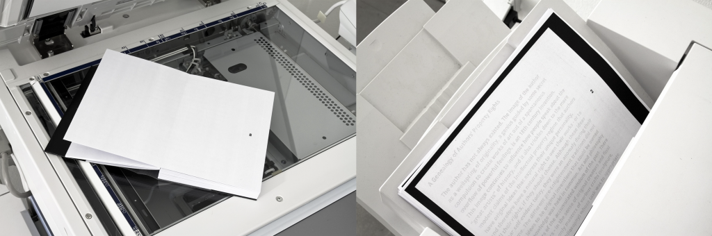
The pages of C.O.P.Y remain empty for the human eye. After xeroxing or scanning the book reveals the essay “Copyright, Copyleft and the Creative Anti-Commons” by Anna Nimus. As in open source development, the text’s quality (legibility) gets better with every copy.
Annotation:
In order to conduct exercises that place human and machine legibility side by side, I also created conditions that are favourable to machines but unfavourable to human recognition. My inspiration comes from Wecke’s project C.O.P.Y. In this work, Wecke constructs a machine-prioritised legibility, where the text in the publication is invisible to the human eye and can only be revealed through photocopying or scanning. This mechanism reverses the conventional reading relationship, making the machine the first reader, while humans can only access legibility through the machine.
This brings the discussion back to the question of who has the right to read. In other words, legibility is not simply a property of text; its boundaries are often determined by who the reading subject is. This becomes evidence for my exploration of the differences between human and machine legibility: how design can manipulate the tendency of legibility and place it within a framework that defines who is able to read.
·
5. Queneau, R. (1998) Exercises in Style. London: John Calder.
Sample:
This is a collection of 99 retellings of the same story, each in a different style.
Annotation:
In Exercises in Style, Queneau’s experiment of rewriting the same text in 99 variations reveals that textual comprehensibility does not depend on a single form, but can be continuously reconstructed through structural variation. The success of these experiments is closely related to human recognition mechanisms: humans can rely on context, experience, and linguistic patterns to maintain understanding even when the style of a text changes drastically, allowing meaning to exist independently of fixed form.
Queneau’s stylistic variations led me to treat my text-distortion website as an experimental field for testing the tolerance of legibility. By adjusting different parameters, I generate a large number of distorted texts, similar to Queneau’s writing experiments, in order to compare human and machine recognition strategies when encountering transformed text. For example, when faced with difficult-to-read text, humans may move closer, step back, or squint to perceive blurred outlines. Machines cannot do this, but they are able to detect subtle pixel-level information that is imperceptible to the human eye, and use large datasets and recognition models to select the most probable result. Although the two recognition systems differ, both gradually clarify their respective analytical paths through changes in the visual form of text.
·
6. Steyerl, H. (2012) ‘In defense of the poor image’, in The wretched of the screen. Berlin: Sternberg Press, p32.
Sample:
The poor image tends toward abstraction: it is a visual idea in its very becoming. (Steyerl, 2012, p.32)
Annotation:
Steyerl describes the poor image as a visual state that tends toward abstraction through continuous circulation and compression. As image quality decreases, meaning is formed through an ongoing process of generation and transformation. This perspective challenges my earlier practice. Previously, I tended to produce illegibility by disrupting character structures in order to distinguish between human and machine recognition. However, Steyerl argues that when visual information is compressed or disturbed, it does not necessarily become unreadable, but instead enters different reading logics—for example, a mode of recognition that depends on distribution and circulation.
This prompted me to reconsider the differences between machine and human recognition, leading me to generate a series of low-quality textual images for machine recognition. In practice, certain low-quality visual states (such as blur or noise) do not prevent machine recognition. In contrast, humans may lose recognition ability earlier when confronted with highly abstract visual information. Therefore, my research direction shifts from producing illegibility to testing asymmetries between different recognition systems (different humans and different algorithmic models), exploring how legibility dynamically shifts and emerges across different cognitive systems.
·
Line of Enquiry
This project investigates how legibility operates differently in human and machine reading systems. Traditional typography is designed to achieve clarity or express a particular mode of interpretation (Flusser, 2011), whereas contemporary computational systems such as OCR rely on specific visual features (character shape, stroke continuity, and contrast & edge) to recognise text. I construct an interactive text-distortion website to interfere with these features and analyse their mechanisms.
The focus of this project is not simply to reduce legibility until both humans and machines fail to recognise text. Instead, I aim to observe how legibility shifts, persists, or breaks down across different systems. By generating conditions where text is machine-readable but human-unreadable, and vice versa, I compare the asymmetry between these two recognition logics. I reconceptualise legibility as a dynamic relationship dependent on the reading subject, and use design as a method to redistribute the capacity for recognition across different cognitive systems.
-
Written Response – Methods of Contextualising
As mentioned in the Brief, the impacts of climate change are reflected across all scales and levels, including any type of boundary such as geographical or social. Our project ‘Know Your Bites’ aims to call for students to pay closer attention to CO2 emissions within UAL catering and to promote environmental awareness. We investigated and calculated the carbon emissions of various food types in the UAL canteen. In order to transform specific data into a Net Zero strategy that better promotes communication, transformation, and connection, we designed a system that is both visual and actionable. We reclassified the ingredients of each dish in the menu by their carbon emissions and, combining color, graphics, and letterpress, designed a series of menus and cards to stimulate audience engagement, integrating carbon emission information into the daily dining of audiences through interactive forms. This project aims to guide students from unconsciousness to an active focus on the ‘Net Zero and Sustainability Implementation Plan’, fostering their continuous attention to seasonal food and food choices under an environmental ecology. Meanwhile, as a participant in this process, as the project progressed, this reflection on observing and focusing on environmental issues from daily life has also become part of shaping my personal awareness, leading me to focus on such topics more continuously and participate in them more actively in the future.
1. HICKEL, J. (2020). Less Is More: How Degrowth Will Save the World. London: William Heinemann.
In this text, Hickel elaborates on the connection between ‘Less Is More’ and ‘Degrowth’, exploring and critiquing the flaws of the binary opposition between humans and nature in Enlightenment philosophy, a perspective that provides core support for our project. Based on Hickel’s discourse on ‘resource limits’ and ‘ecological regeneration’, the root cause of the climate crisis and ecological collapse lies in an economic system aimed at infinite growth. Pursuing infinite GDP growth within the finite resources of the Earth is inherently unsustainable. Therefore, Hickel proposes ‘Degrowth’ as an alternative path to planned reduction of unnecessary production and consumption, changing the current state of overexploitation of the global environment.
We extended our research direction toward finding a balance between humans and ecology, reflecting on how to use existing environments and resources in a transformative form to stimulate environmental awareness. Consequently, we chose to incorporate seasonal food into participatory design, transforming food choice from an unconscious act of consumption into a systemic interactive experience. This critiques the current market’s numbness and dependence on globalized supply chains and uses design practice to shape ecological care.
2. SHUKIN, N. (2009). Animal Capital: Rendering Life in Biopolitical Times. Minneapolis: University of Minnesota Press
In Animal Capital, Shukin reimagines what constitutes animal life, exploring how animal life is transformed into ‘value’ within the contemporary capitalist production system and exploited and utilized on both material and symbolic levels. Based on this, Shukin proposes the concept of ‘Rendering’. In the context of this book, ‘Rendering’ possesses a double meaning: on one hand, animals serve as rendered material resources; on the other hand, animals are treated as a symbolic resource that can be visually represented (render image). Shukin draws upon Michel Foucault’s concept of ‘Biopolitics’ in the book, namely the management and governance of life, to discuss how modern power manages animal life and how animal life is commodified, revealing that animals have become a form of life that can be extracted at will.
Shukin’s theoretical framework prompts us to examine the carbon emission data provided in databases, which simplify animals, vegetables, and land into formulas, reflecting the alienation and marginalization of life through symbolic rendering. This perspective reminds us: are these data merely abstracting living beings and simplifying them into calculable units within market logic? Therefore, our research also encompasses how to reshape the visibility and the right to existence of life within the context of the contemporary world. Consequently, we organized the carbon emission data of food in the UAL canteen and, through re-design, transformed the numbers back into a form that can be seen, allowing audiences to have a clearer perception of animal life.
3. COLOMINA, B. and WIGLEY, M. (2016). Are We Human? Notes on an Archaeology of Design. Zürich: Lars Müller Publishers.
In this book, the dialectical relationship of mutual shaping between design and humans is revealed. Colomina and Wigley argue that design is not a tool created by humans, but rather the two shape each other, providing a driving force for humanity in this process. The book mentions, ‘Design is everywhere, and we are completely suspended in design.’ This perspective inspired our thinking, and we view the project ‘Know Your Bites’ as a bond connecting design and humans, combining CO2 emissions data, design, and our thoughts as a form of co-created two way communication. This bidirectionality also means that when audiences read the CO2 emissions information through our visual system, they are also participating in the process of co-evolution through design intervention. The displays in the menu and the indentations in the letterpress shape the sensory experience of every participant. We use ‘Know Your Bites’ to explore how design implants the previously absent environmental perception into peoples daily intuition, thereby subtly shaping peoples perception of ecology through every dietary choice.
4. KLOPPENBURG, J., HENDRICKSON, J. and STEVENSON, G.W., 1996. Coming into the foodshed. Agriculture and Human Values, pp. 33-42.
We chose Coming into the foodshed (Kloppenburg, Hendrickson and Stevenson, 1996) as a reference, providing our project with a critical geographical and sociological perspective. As a foundational work in foodshed studies, this article challenges the spatial alienation brought by globalized food systems and proposes the necessity of repairing the relationship between humans and the ecological environment by reconstructing local ‘food identity’. In the specific context of the UAL canteen, students are passive consumers detached from the source of production. This article allows us to present the reduction of food miles through design and provides purpose and meaning for lowering CO2 emissions.
Inspired by this, we focused on seasonal ingredients and designed a set of canteen cards based on the foodshed concept, guiding audiences to step beyond the alienated feelings of the global food system (Kloppenburg et al., 1996, p. 35). From the critique of macro systems to the transformation of micro design, this both responds to the theme of space and scale and reshapes a food citizenship with local perception within the UAL canteen, making environmental care an action that people actively desire to connect with. This truly achieves the reconstruction of the relationship between humans and the food system within the campus context.
5. QUENEAU, R. (1998) Exercises in Style. London: John Calder.
In Exercises in Style, Queneau reconstructed the same story through ninety nine stylistic variations. He stripped away the narrative rhetoric, retaining only the overall structure of the story to reshape textual meaning and reader perception, forming a series of systemic deconstructive grammars.
Queneau’s writing experiments emphasized that ‘form is content’, and inspired by this, we view the UAL kgCO2e data as a narrative master text to be dismantled. We then conducted experiments in visual style exploration on this entity.
Under this design logic, the kgCO2e data of the dishes was dismantled by us into different ingredient categories. Based on the kgCO2e content of each dish, we rearranged the dishes on the menu in order from minimum kgCO2e to maximum kgCO2e, creating a rhythmic spatial order. Through the imbalance and emphasis of visual proportions, audiences can intuitively understand the kgCO2e weight of each dish through the area occupied by the icons, prompting them to establish a deep logical digestion of the food carbon footprint within this highly organized visual grammar.
6. AMODESTI, E., GRANDE, N. and VALLEJO, S. (eds.) (2023). FOODSCAPES: Spanish Pavilion at the 18th International Architecture Exhibition – La Biennale di Venezia. [Online] e-flux. Available at: https://www.e-flux.com/announcements/531430/foodscapes [Accessed 1 Mar. 2026].
FOODSCAPES (2023) is a project in the Spanish Pavilion at the Venice Biennale, which transforms the food system from a consumption behavior into a perspective of metabolic architecture. The Total Recipes project within FOODSCAPES reveals the massive infrastructure chain connected behind every bite of food, from greenhouses and logistics networks to cold chains, linking the menu system with ecological reality.
This project also influenced our way of deconstructing the menu. Traditional recipes often obscure the production chain, whereas this project advocates for clearly layering the origins of food. Therefore, we combined the stylistic variations of Exercises in Style with the Total Recipes from this project to dismantle each dish into five major systems: seasoning, vegetable, carbohydrate, dairy, and meat. Through the color gradients and grid order in the menu, we intuitively present the food production chain to audiences, encouraging more people to participate. Ultimately, we hope this knowledge does not only stay in the canteen. We look forward to students taking what they have learned back home, sharing it with others, and applying it to their daily lives.
-
Written Response – Methods of Iterating
Draft 1
In this project, I chose Silvio Lorusso’s poster work We Are Human Beings. This poster uses machine generated distorted fonts to write a manifesto of resistance against technological violence. In Silvio Lorusso’s view, CAPTCHAs, as a dehumanizing force, are a means of control applied to ‘technocratic bureaucracy’. CAPTCHAs are both the gateway to accessing websites and the way machines verify and judge us. Regarding this, I have combined two theoretical perspectives: Rouvroy and Berns (2013, pp. 163-196) point out that ‘Algorithmic Governmentality’ turns technological tools into an invisible management mechanism. Furthermore, according to Marx’s (1959) theory of ‘Alienation’, a relationship of estrangement and opposition arises between the producer and the objects they create. I use this to focus on the phenomenon of ‘power inversion’ in the digital age.
The research point I propose is: In a situation where machines judge human authenticity, how can graphic design respond to this alienated ‘Algorithmic Governmentality’?
I hope to use this as a starting point for studio design practice to explore those moments filled with tension and differentiation between humans and machines in the era of computer algorithms.
References:
Marx, K. (1959). Economic and Philosophic Manuscripts of 1844. Translated by M. Milligan. Moscow: Progress Publishers. (Original work written 1844).
Rouvroy, A. and Berns, T. (2013). ‘Algorithmic governmentality and prospects of emancipation’, Réseaux, 177(1), pp. 163-196.
Draft 2
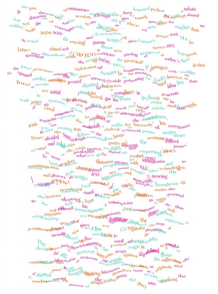
In the past three weeks of continuous experimentation, I have learned Python to build a website for text distortion as my tool for iteration. Through this, I aim to touch upon an increasingly absurd reality: under the rule of computer code, we are living in an era where we must prove to machines that we are ‘human.’
My project began with the copying and deconstruction of Silvio Lorusso’s poster work, ‘We Are Human Beings!’. Lorusso uses the visual style of CAPTCHAs to distort text, placing Mario Savio’s 1964 ‘Free Speech Movement’ manifesto within the poster to criticize the inversion of power in today’s digital age (Savio, 1964).
In the past, protesters resisted the exploitation of humans by computers by damaging early storage devices (punch cards), making the letter shapes unrecognizable to the machines. Today, however, we are forced to accept machine generated distorted characters, performing this digital labor just to gain the right to use a computer.
In my initial copy task, I tried using the Pillow library in Python to generate static images to recreate the distortion effect from the poster. I became caught up in the struggle of the visual output. The text produced by the code was either too regular and stiff, or it completely lost its readability due to uncontrolled randomness.
While repeatedly adjusting the code, I began to realize that the distorted, low recognition text I was creating was essentially a challenge to the ‘hierarchy’ of images. This is what Hito Steyerl defines as the ‘Poor Image.’ Steyerl points out that images are divided by class. High resolution images represent the aesthetic control of capital and authority, while blurred, pixelated, and over compressed ‘poor images’ can be seen as the ‘proletariat’ of the digital age (Steyerl, 2012, pp. 41-43).
To further explore what text distortion means for the identification and communication of content, I combined programming with SVG Filters technology to stretch and distort pixels, turning text into new poster images. By distorting the text, I gradually stripped the images of their readability and materiality. Throughout the iterations, I produced a large number of low quality images to simulate the blurring of visuals and meanings on the internet.
As the iterations deepened, I began to view the websites I built as a testing ground for wear and tear. For this reason, I added a ‘Loop’ command to the site, using repetition based instructions to constantly generate new images and find the breaking point where text meaning disappears. After the fixed distortion parameters looped dozens of times, the text vanished completely. This loop experiment responds to the view of Steyerl (2012, p. 43) regarding the collapse of meaning caused by the medium or tool consuming the content.
This process pushed me to examine the position and responsibility of graphic design in the age of algorithms. In graphic design, design is defined as a way to communicate information. However, in the struggle against algorithms, design can also transform into a type of resistant deconstruction, responding to the infiltration of digital power by actively creating information opacity. Just as I originally tried to translate meaning through tools, the tools themselves were actually dissolving that meaning. The process of disappearing proves that they once existed.
References:
Savio, M. (1964) Sproul Hall steps speech. [Speech] University of California, Berkeley, 2 December. Available at: https://fsm.berkeley.edu/mario-savios-speech-at-sproul-hall-steps/ (Accessed: 11 February 2026).
Steyerl, H. (2012) ‘In defense of the poor image’, in The wretched of the screen. Berlin: Sternberg Press, pp. 31–45.
Draft 3
-
Iterating – week 4
In last week’s update, I added a feature to change the canvas background color. Now you can now use the “Eyedropper Tool” to pick any color you want. So you can hide certain parts of the text by making them the same color as the background.
So I did a small text experiment using “out of context” writing to show it more clearly. But because the colors are generated randomly, it ended up creating some grammar mistakes. I tried to fix it many times, but I couldn’t get a perfect result. This is the best version so far. The original text was: “I had an argument with my friend today. At first, I didn’t realize my own fault; I felt I hadn’t done anything wrong and that it was all her fault. But later, I recognized my mistake.” But after some information was hidden, the meaning changed to: “I had argument with friend today. First fault. I felt I hadn’t done anything wrong, it was all her fault.”
To test the limits of the distortion settings, I added a “loop” command. This just repeats the parameters you’ve already set. You can choose how long it lasts and how many times it loops. In the first two versions, the image starts to show a “glitch effect” by the fifth loop. By the thirty-ninth loop, the information completely disappears.
I also added a feature to upload images. Now, you can choose to distort either the text or the image itself.
You can try lots of different combinations of emojis or emoticons. I think these distorted visual expressions are the most fun way to play with the website.
-
Iterating – week 2
For this week’s copy task, I tried using Python to write code that generates static images. But after changing the code a few times, I still couldn’t get the look I wanted. So, I decided to build a website instead. I updated the site several times, and finally, I managed to copy the original poster in a web format.
At the beginning, I used ‘Terminal’ and ‘IDLE’ to write my code. I installed a plugin called ‘Pillow’ to create the images. I used the ‘Arial’ font and wrote some code for random colors to mimic the colorful look of the poster. To get that wavy, distorted text effect, I added ‘sine wave’ instructions to the code. I set the amplitude, frequency, and range, and then I got my first output.
But the words in the image are impossible to read. Also, the resolution and colors don’t really match the original poster.
I fixed these issues by lowering the frequency to make the text readable. I also changed the font to fix the missing punctuation marks. However, this created a new problem: the letters looked too perfect. Every line of text curved in exactly the same way, so it looked like noodles. Also, because the text was centered, some words were broken apart, and others were cut off at the edge of the image.
So, I kept adjusting the distortion. I used ‘dynamic calculation’ to control the weight and height of the words. This fixed the line breaks and made sure all the text stayed inside the frame. I also made sure each word had its own color. But the new images had the same old problem: they were completely unreadable again.
That is when I tried a different approach. I started building a website that can distort fonts. After you type in the text, you can adjust the distortion, weight, size, height, and color.
In my second update, I added animations. The words can float up and down or rotate. I also added support for exporting the files as PNG or GIF in different resolutions. But even then, I still hadn’t achieved that specific distorted look for the fonts.
The third time, I finally matched the style of the original poster using a ‘liquid distortion’ effect. I used ‘SVG Filters’ to stretch and twist the pixels. This is actually a core technology used to create CAPTCHAs.
In the final output, I refined the animation features even more and added more randomness to the movement.