
Annotated Bibliography:
1. Drucker, J. (1994) The Visible Word: Experimental Typography and Modern Art, 1909–1923. Chicago: University of Chicago Press, p.3.
Sample:
Typography operates as a visual system, not merely a linguistic one. (Drucker, 1994, p.3)
Annotation:
Drucker defines typography as a visual system rather than merely a linguistic carrier, which leads me to understand legibility as a visual condition that can be reshaped, or as a strategy that can be practiced. My aim is to explore the similarities and differences between machine and human mechanisms of recognising legibility. Humans can rely on context and association to complete meaning from incomplete information, whereas machines tend to depend on character outlines and structural features to make logical inferences.
In order to obtain more samples to analyse my research direction, I added functions to my website (my project) that can disrupt the visual structure of text. These functions are built based on OCR (Optical Character Recognition) mechanisms, including character shape, stroke continuity, and contrast & edge. Through this mode of practice, I challenge both human and machine modes of understanding, and identify the fundamental differences between these two recognition systems in the process.
·
2. Flusser, V. (2011) Does Writing Have a Future? Minneapolis: University of Minnesota Press, p.3.
Sample:
Information is now more effectively transmitted by codes other than those of written signs. (Flusser, 2011, p.3)
Annotation:
Flusser’s discussion of technical images and coding systems points out that writing is shifting from a linear structure based on the alphabet to an information system composed of multiple technical codes. This suggests that in the future, text may gradually no longer be intended for human reading, but instead exist in forms that are more easily processed by machines, such as being handled and transmitted through more efficient technical media. These codes transform text into data structures, thereby altering how legibility is determined. However, this does not mean that human reading systems should be marginalised.
Based on this, my project explores and questions how legibility will be redefined when writing is taken over by machines. Therefore, I interfere with OCR recognition mechanisms to resist this tendency, allowing text to detach from machine grammar. Through this practice, I aim to explore whether design can possess the possibility of refusing machine recognition, and whether we can use design to reclaim ownership over text—for example, by creating distorted typography that can only be understood by humans but not recognised by machines.
·
3. Yang, J. (2020) Motion typography of Back to Me. Available at: https://bennybiangbiang.com/Back-to-me (Accessed: 27 April 2026).
Sample:
Annotation:
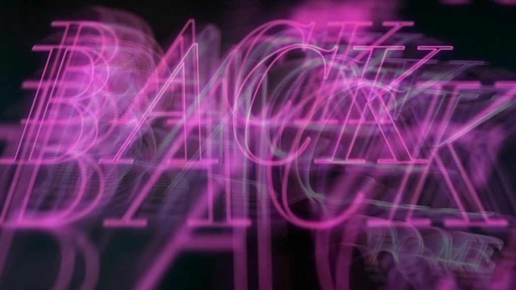
During my research, I found that machines’ ability to recognise dynamic content is significantly weaker than that of humans. This led me to explore dynamic typographic effects. The film produced by Yang inspired me to experiment with dynamic deformation of text.
In this film, the motion of the text changes according to the rhythm of the background music; the more intense the rhythm, the greater the amplitude of the movement. This makes legibility a constantly shifting condition.
For machines, recognition relies on clear character structures within fixed frames, and dynamic deformation interferes with OCR detection mechanisms. Humans, however, can integrate information through temporal continuity; even if a single frame cannot be recognised, meaning can still be inferred through the process of change. In my website, I combine animation speed with distortion so that text remains in a continuously unfinished state, creating a reading environment that is unfriendly to machines but perceptible to humans. This reinforces the distinction that human recognition is temporal, while machine recognition is structural.
·
4. Wecke, M. (2013) C.O.P.Y. P—DPA. Available at: https://p-dpa.net/work/c-o-p-y/ (Accessed: 27 April 2026).
Sample:
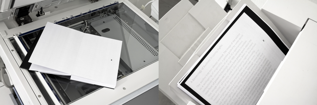
The pages of C.O.P.Y remain empty for the human eye. After xeroxing or scanning the book reveals the essay “Copyright, Copyleft and the Creative Anti-Commons” by Anna Nimus. As in open source development, the text’s quality (legibility) gets better with every copy.
Annotation:
In order to conduct exercises that place human and machine legibility side by side, I also created conditions that are favourable to machines but unfavourable to human recognition. My inspiration comes from Wecke’s project C.O.P.Y. In this work, Wecke constructs a machine-prioritised legibility, where the text in the publication is invisible to the human eye and can only be revealed through photocopying or scanning. This mechanism reverses the conventional reading relationship, making the machine the first reader, while humans can only access legibility through the machine.
This brings the discussion back to the question of who has the right to read. In other words, legibility is not simply a property of text; its boundaries are often determined by who the reading subject is. This becomes evidence for my exploration of the differences between human and machine legibility: how design can manipulate the tendency of legibility and place it within a framework that defines who is able to read.
·
5. Queneau, R. (1998) Exercises in Style. London: John Calder.
Sample:
This is a collection of 99 retellings of the same story, each in a different style.
Annotation:
In Exercises in Style, Queneau’s experiment of rewriting the same text in 99 variations reveals that textual comprehensibility does not depend on a single form, but can be continuously reconstructed through structural variation. The success of these experiments is closely related to human recognition mechanisms: humans can rely on context, experience, and linguistic patterns to maintain understanding even when the style of a text changes drastically, allowing meaning to exist independently of fixed form.
Queneau’s stylistic variations led me to treat my text-distortion website as an experimental field for testing the tolerance of legibility. By adjusting different parameters, I generate a large number of distorted texts, similar to Queneau’s writing experiments, in order to compare human and machine recognition strategies when encountering transformed text. For example, when faced with difficult-to-read text, humans may move closer, step back, or squint to perceive blurred outlines. Machines cannot do this, but they are able to detect subtle pixel-level information that is imperceptible to the human eye, and use large datasets and recognition models to select the most probable result. Although the two recognition systems differ, both gradually clarify their respective analytical paths through changes in the visual form of text.
·
6. Steyerl, H. (2012) ‘In defense of the poor image’, in The wretched of the screen. Berlin: Sternberg Press, p32.
Sample:
The poor image tends toward abstraction: it is a visual idea in its very becoming. (Steyerl, 2012, p.32)
Annotation:
Steyerl describes the poor image as a visual state that tends toward abstraction through continuous circulation and compression. As image quality decreases, meaning is formed through an ongoing process of generation and transformation. This perspective challenges my earlier practice. Previously, I tended to produce illegibility by disrupting character structures in order to distinguish between human and machine recognition. However, Steyerl argues that when visual information is compressed or disturbed, it does not necessarily become unreadable, but instead enters different reading logics—for example, a mode of recognition that depends on distribution and circulation.
This prompted me to reconsider the differences between machine and human recognition, leading me to generate a series of low-quality textual images for machine recognition. In practice, certain low-quality visual states (such as blur or noise) do not prevent machine recognition. In contrast, humans may lose recognition ability earlier when confronted with highly abstract visual information. Therefore, my research direction shifts from producing illegibility to testing asymmetries between different recognition systems (different humans and different algorithmic models), exploring how legibility dynamically shifts and emerges across different cognitive systems.
·
Line of Enquiry
This project investigates how legibility operates differently in human and machine reading systems. Traditional typography is designed to achieve clarity or express a particular mode of interpretation (Flusser, 2011), whereas contemporary computational systems such as OCR rely on specific visual features (character shape, stroke continuity, and contrast & edge) to recognise text. I construct an interactive text-distortion website to interfere with these features and analyse their mechanisms.
The focus of this project is not simply to reduce legibility until both humans and machines fail to recognise text. Instead, I aim to observe how legibility shifts, persists, or breaks down across different systems. By generating conditions where text is machine-readable but human-unreadable, and vice versa, I compare the asymmetry between these two recognition logics. I reconceptualise legibility as a dynamic relationship dependent on the reading subject, and use design as a method to redistribute the capacity for recognition across different cognitive systems.
Leave a Reply